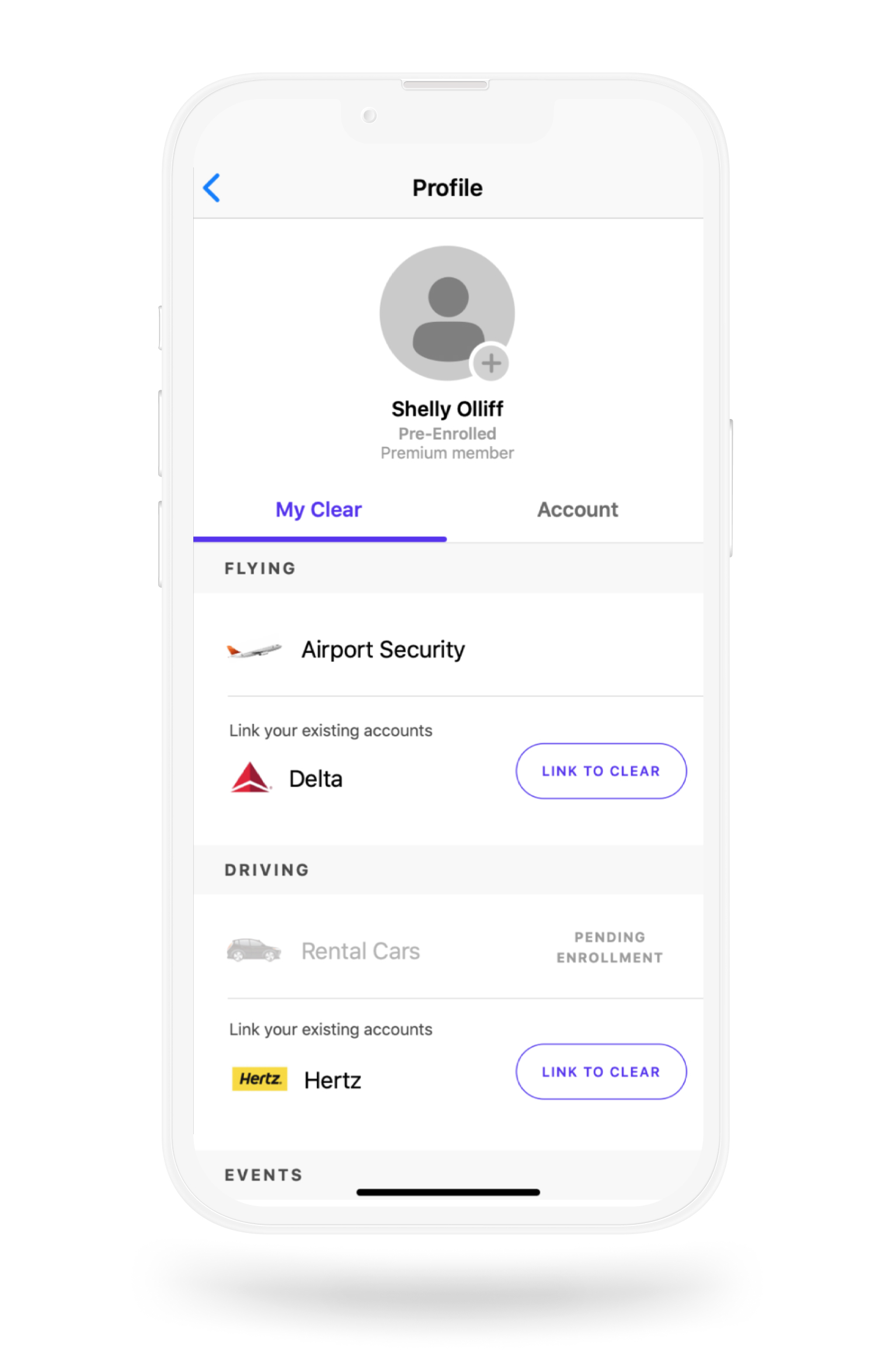
What's CLEAR?
CLEAR is a biometric authentication service that uses your eyes and fingerprints to verify your identity to gain easy entry.
Project Goal
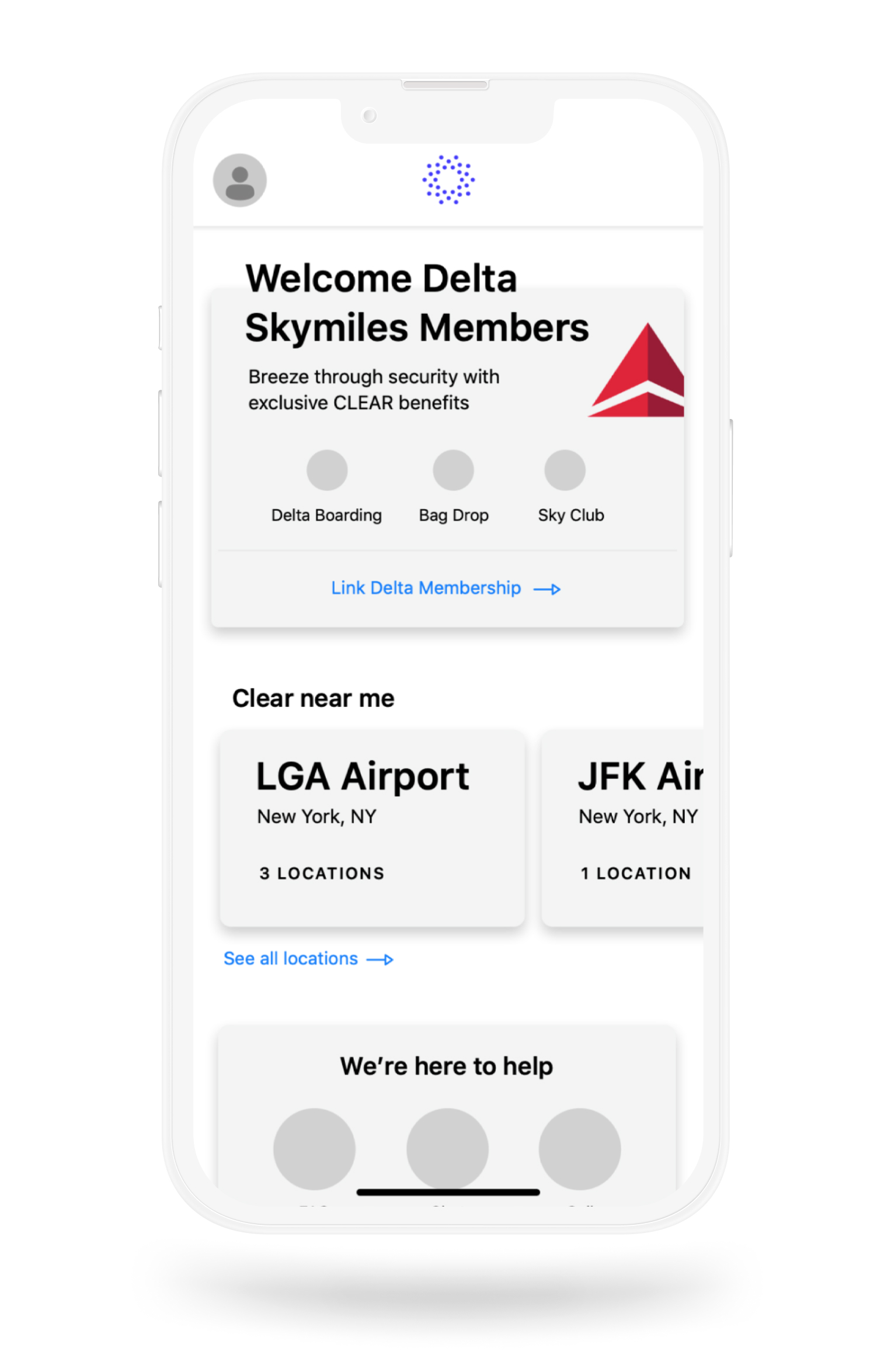
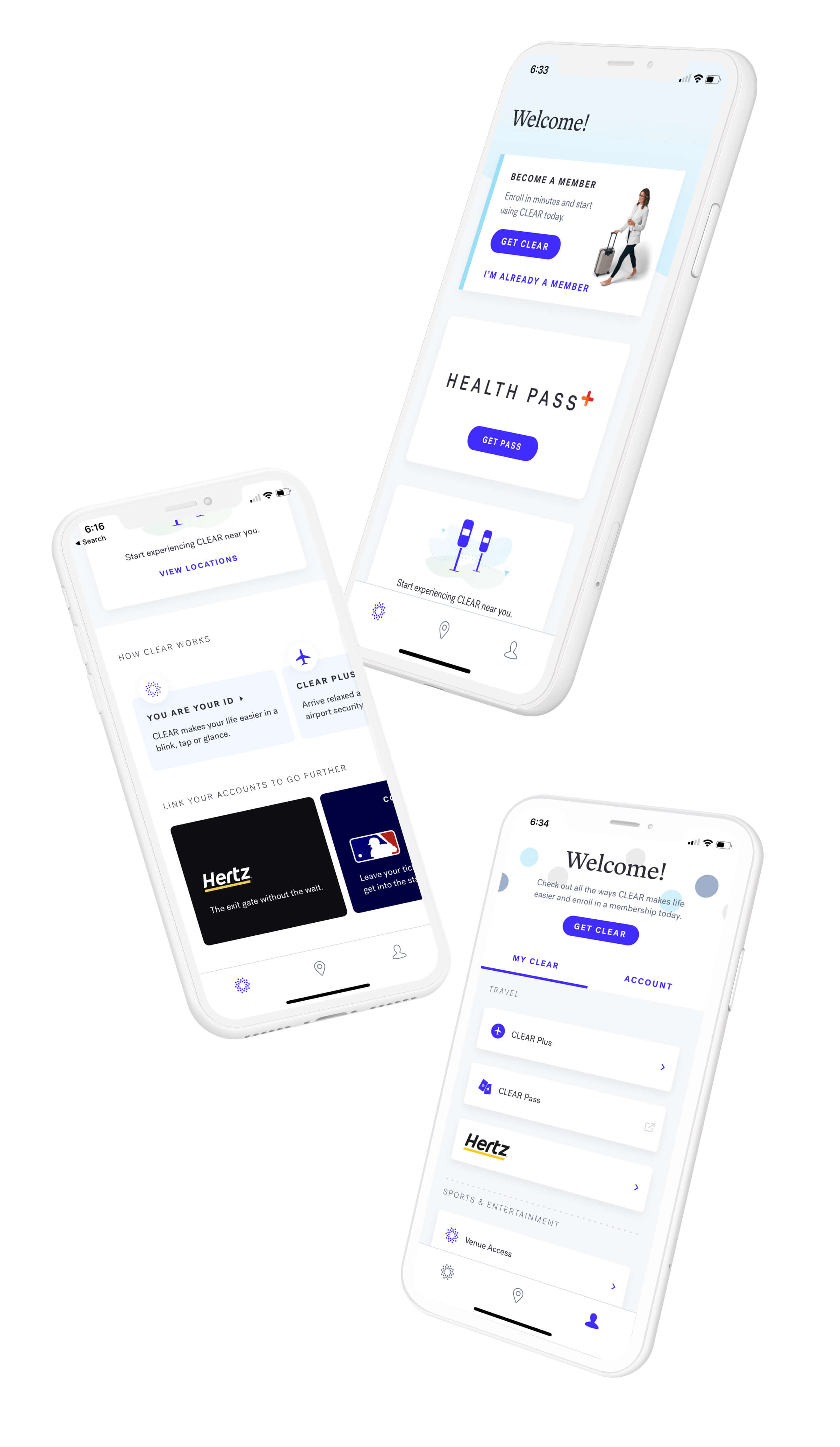
CLEAR needed a mobile app for users to complete enrollment, upgrade to new services, and find the nearest CLEAR pod locations.
I was brought on the project to create the navigation model for the app. I also provided recommendations on the upsell strategy of CLEAR's emerging future products.
Defining App Goals
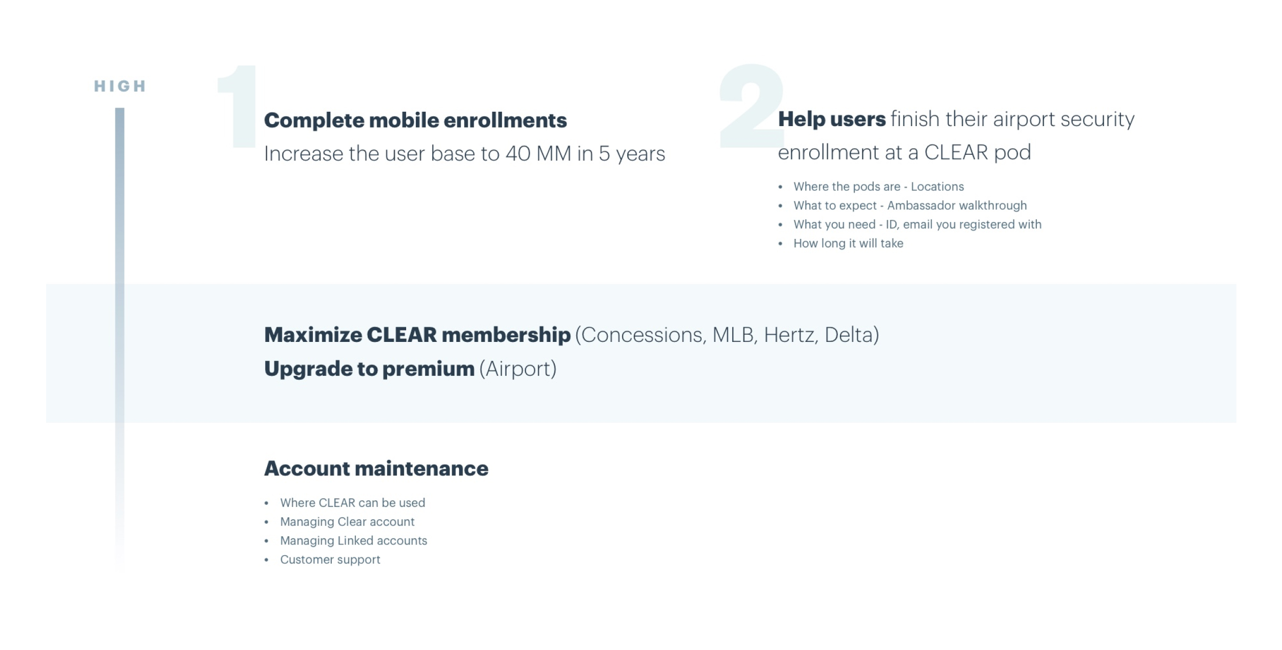
In addition to completing enrollment for new users, I needed to understand and define priorities for additional app goals to inform an impactful navigation model.
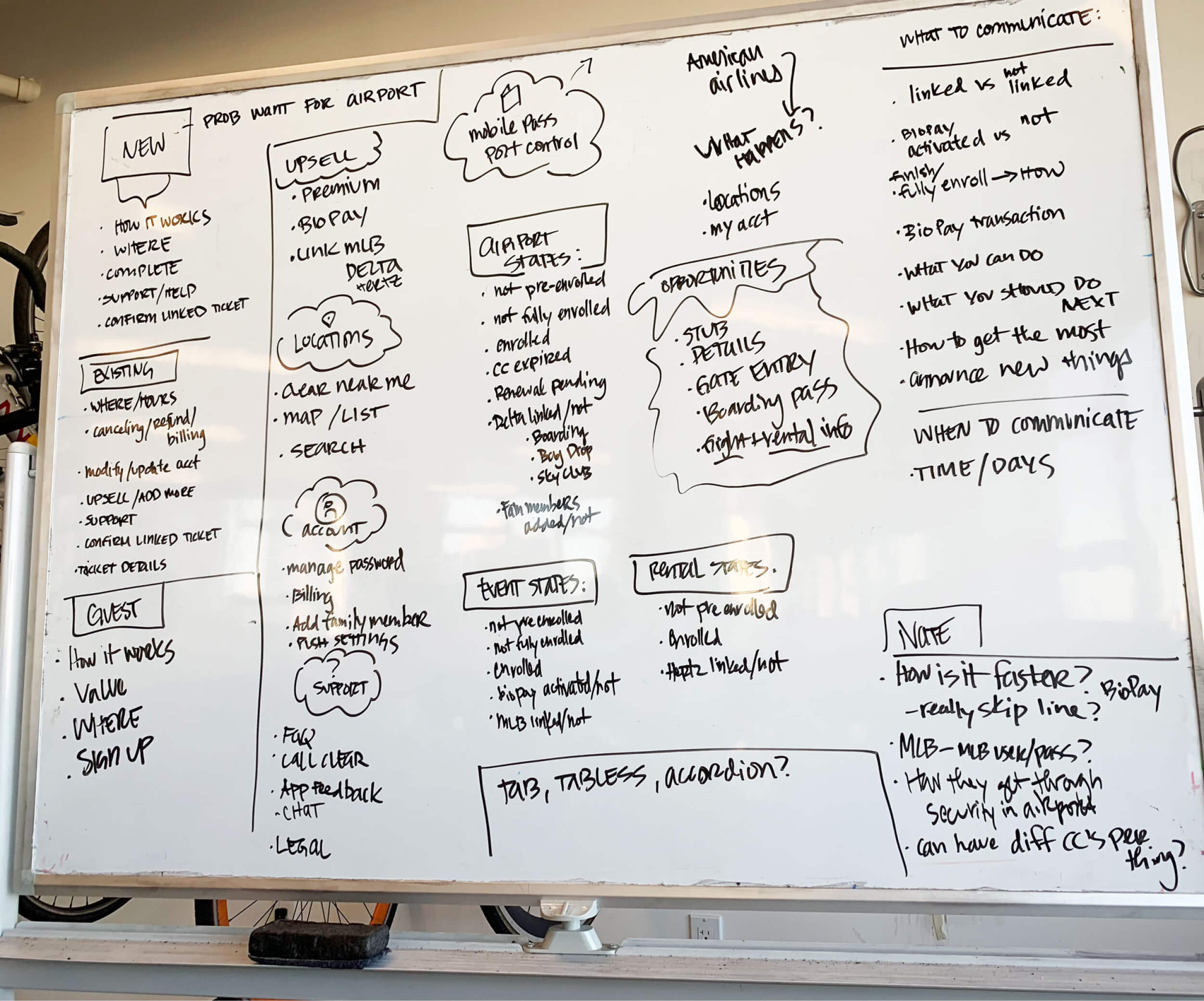
Prioritizing Key Goals
Ideations & Concepts
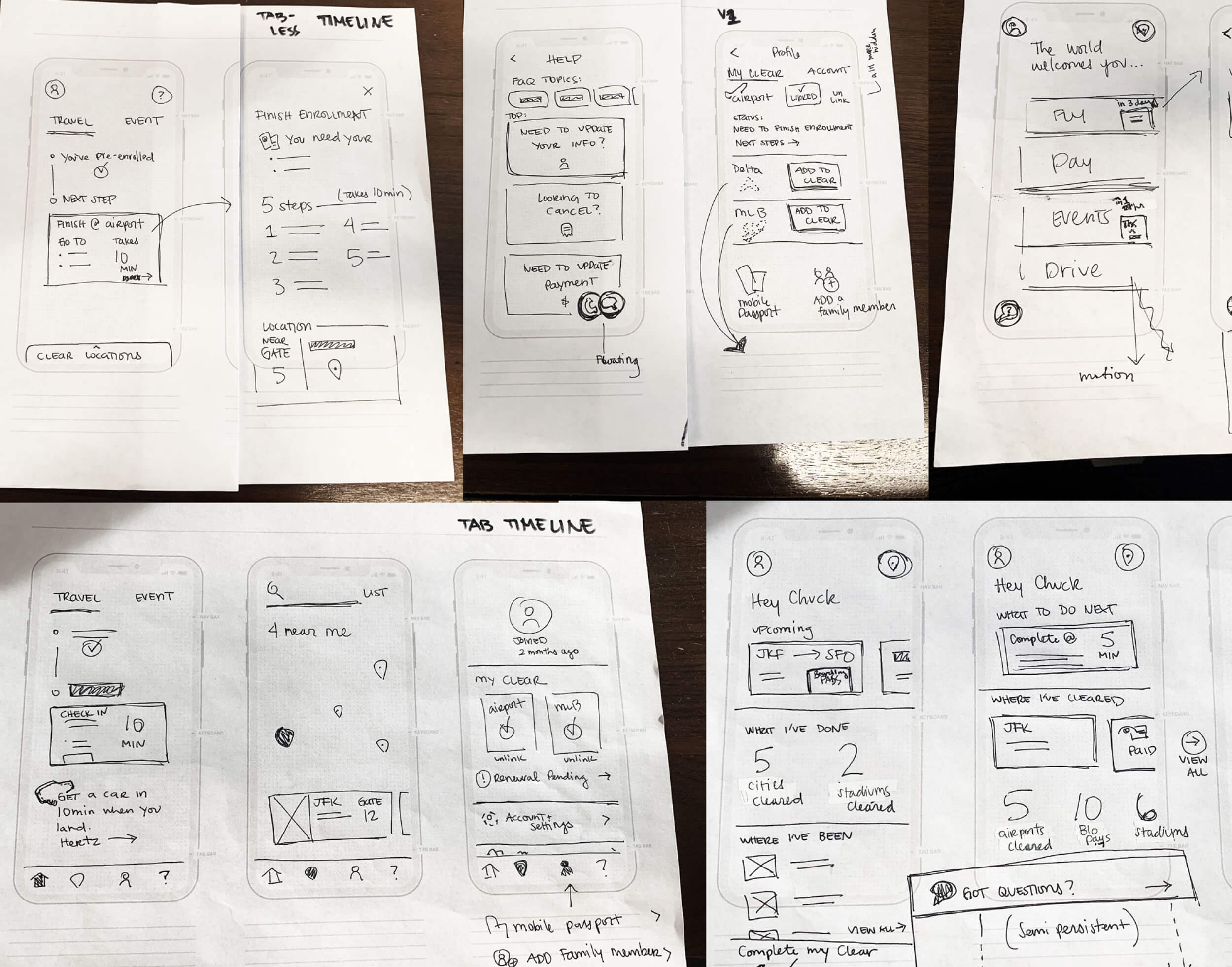
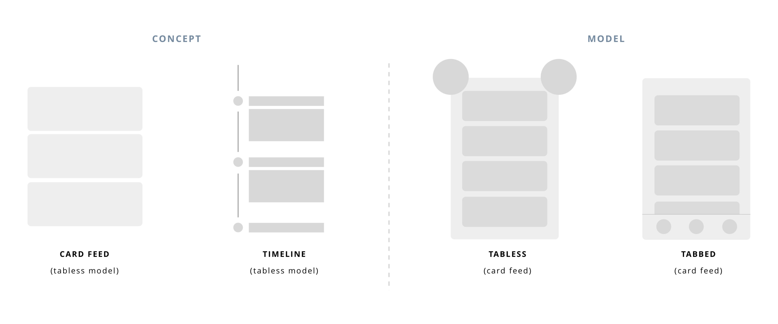
I explored different navigation models and remote tested concepts with users.
Improving Communication Strategy
A design challenge was uncovering how we might help users see the benefits of enhancing their accounts with additional services. I solved for this by matching the users mindset to upsell at the “right” time and place when they would most likely enhance their CLEAR account.
User Scenario:
After landing from a long flight, a user goes to retrieve their bags from baggage claim.
During this time, we present the user with a car rental upsell to connect their account with the Hertz partner program.
This allows the user to easily rent a car and have it ready for pick up as soon as they arrive at the transportation area.

A clear & guided experience
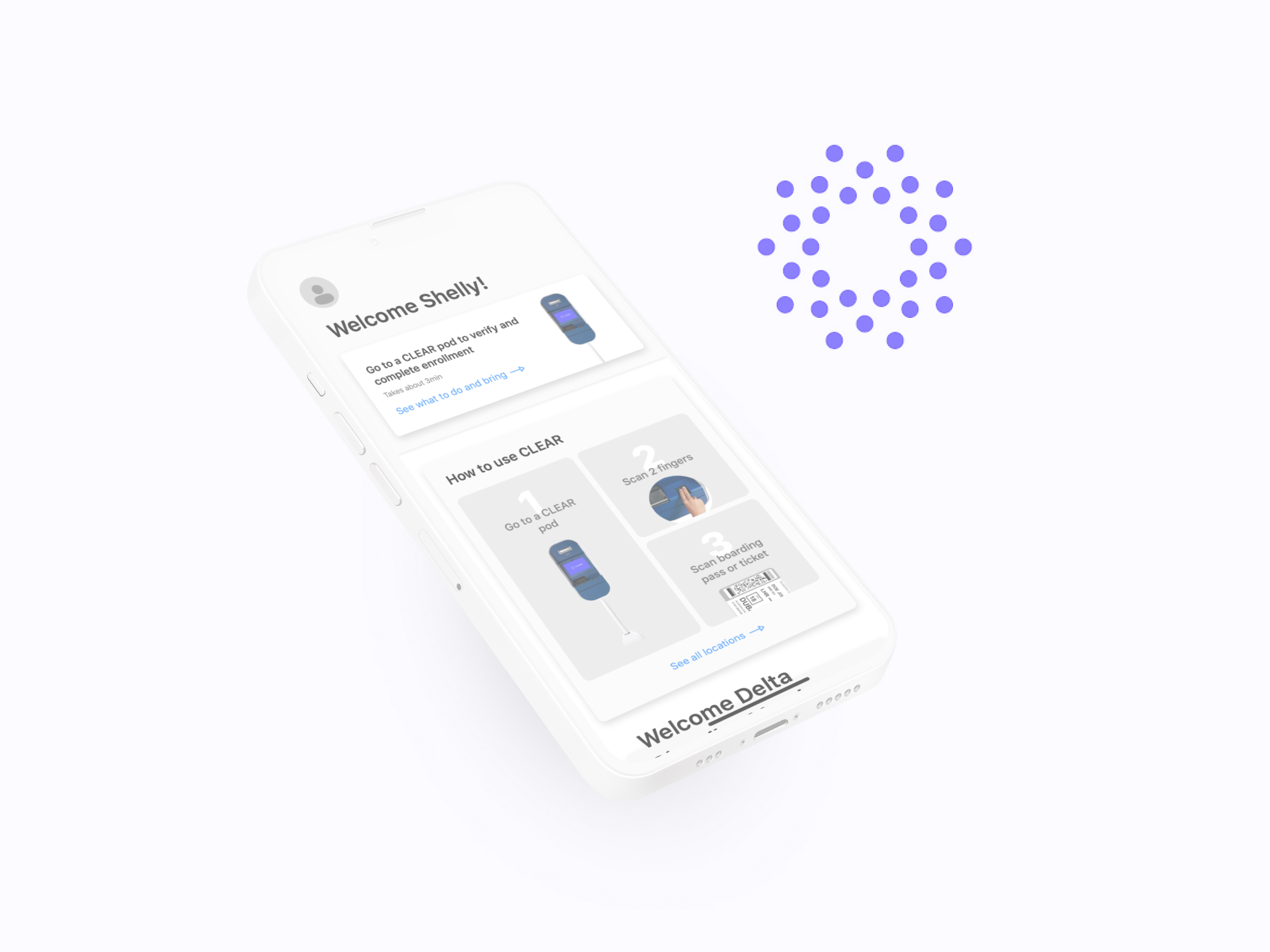
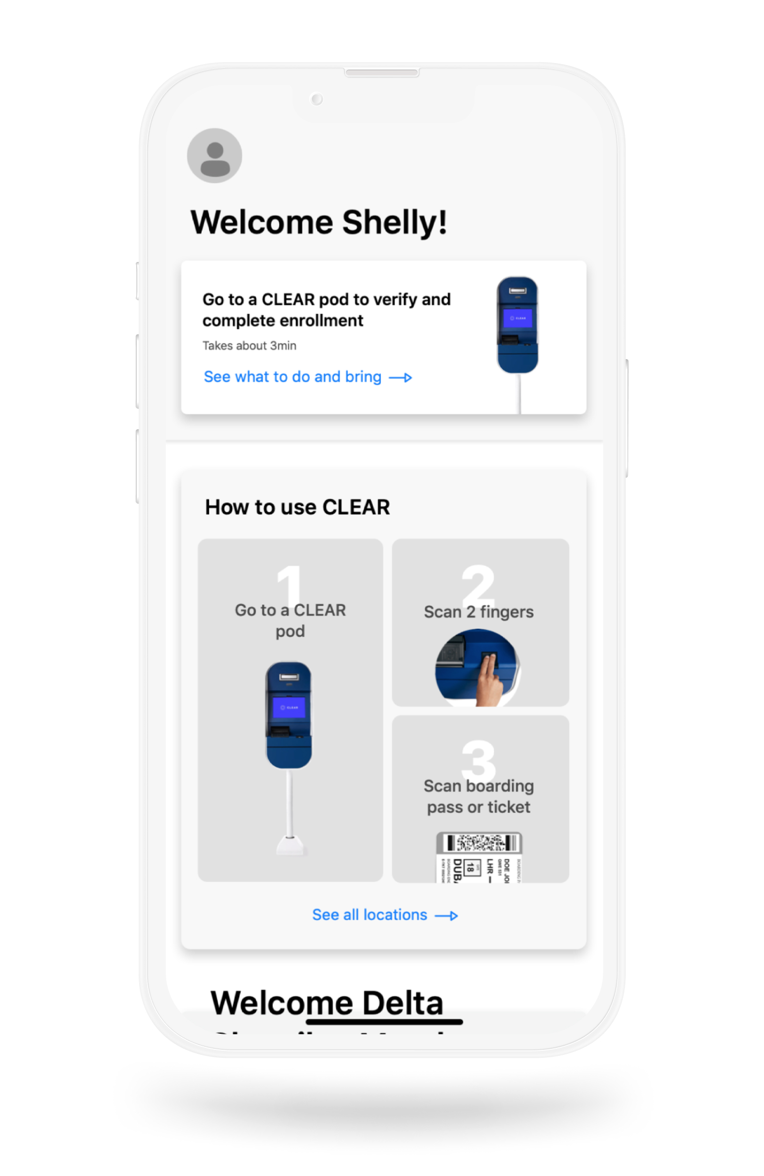
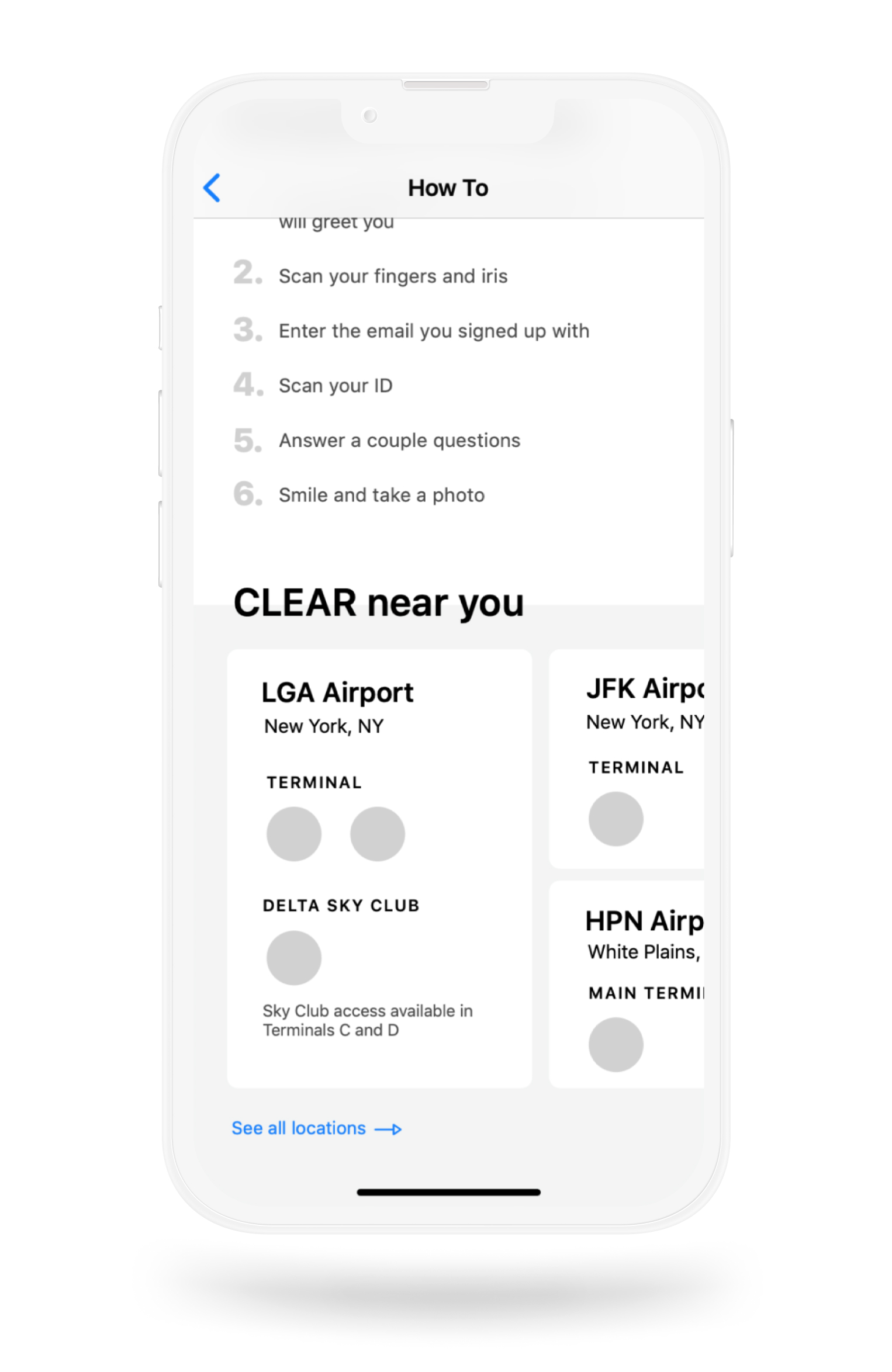
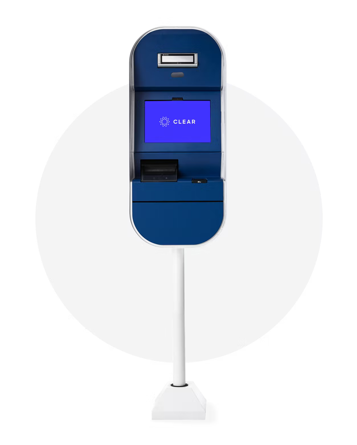
A key goal for the app was to provide a guided path forward for users to complete enrollment at a physical CLEAR pod, and easily find it's location. To help set expectations, I included images of the pod and incorporated guided numeric steps to reduce any friction when entering the physical space.
The Result
iOS wireframes

