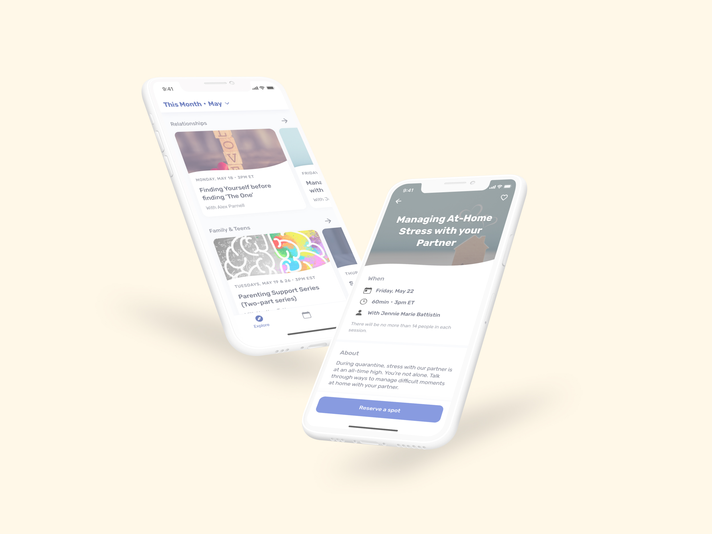
About Sesh
Mental healthcare shouldn't be expensive.
As mental health services are unaffordable for a majority of Americans, Sesh is making therapy affordable through remote therapist-lead support groups that are curated for people who wouldn’t normally have access.
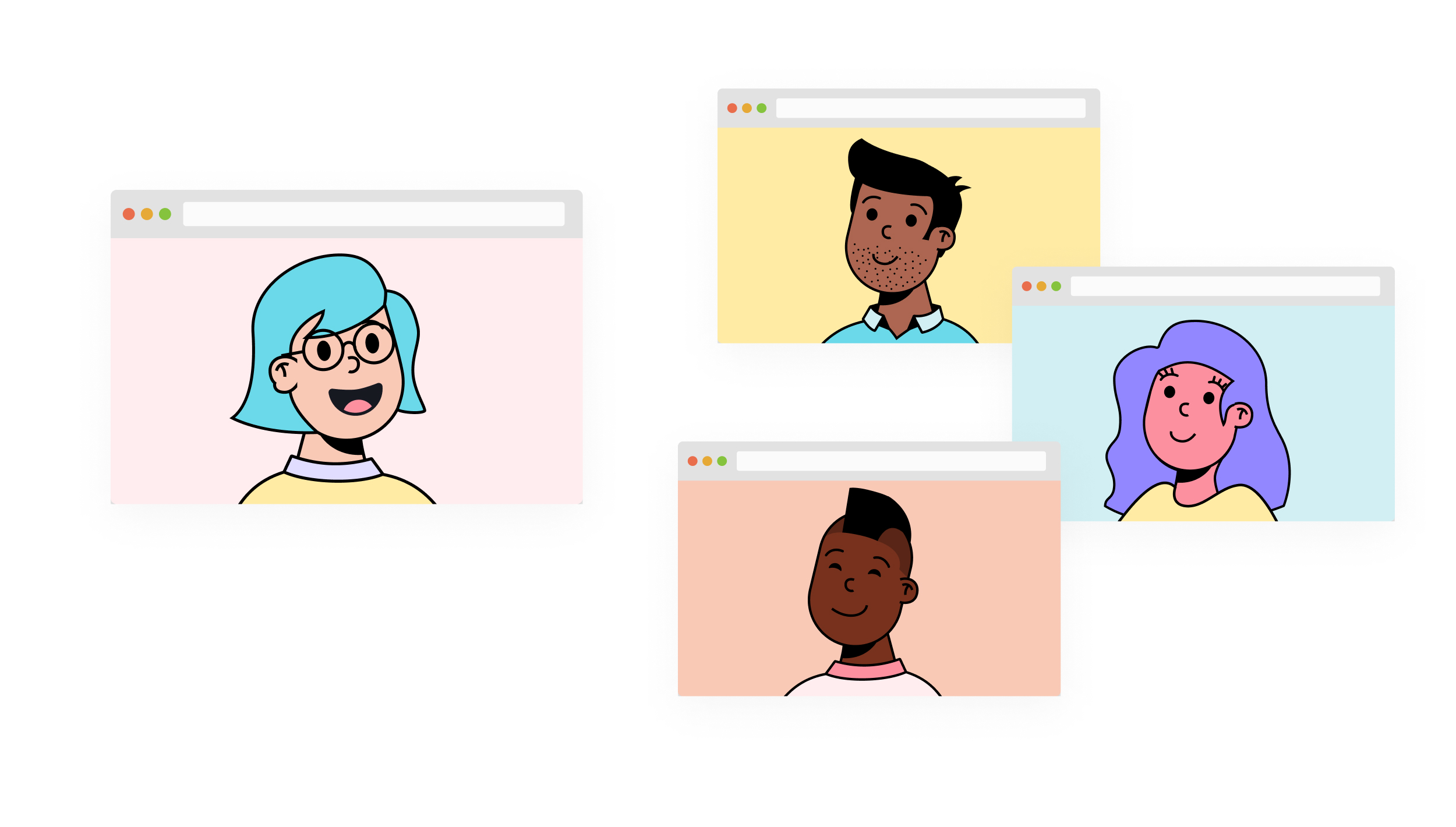
The Differentiator
Inclusive curation for diverse groups
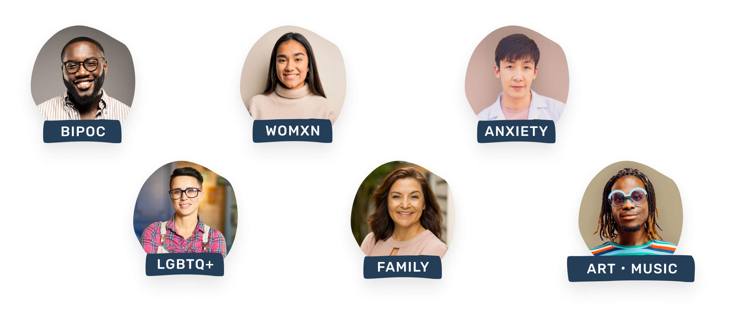
"We built our platform for those who were left out of the mental health conversation by offering inclusive session topics led by culturally competent therapists from these communities."
— COO Alyssa Musket, Forbes Interview
Project Goal
Taking the product to the next level
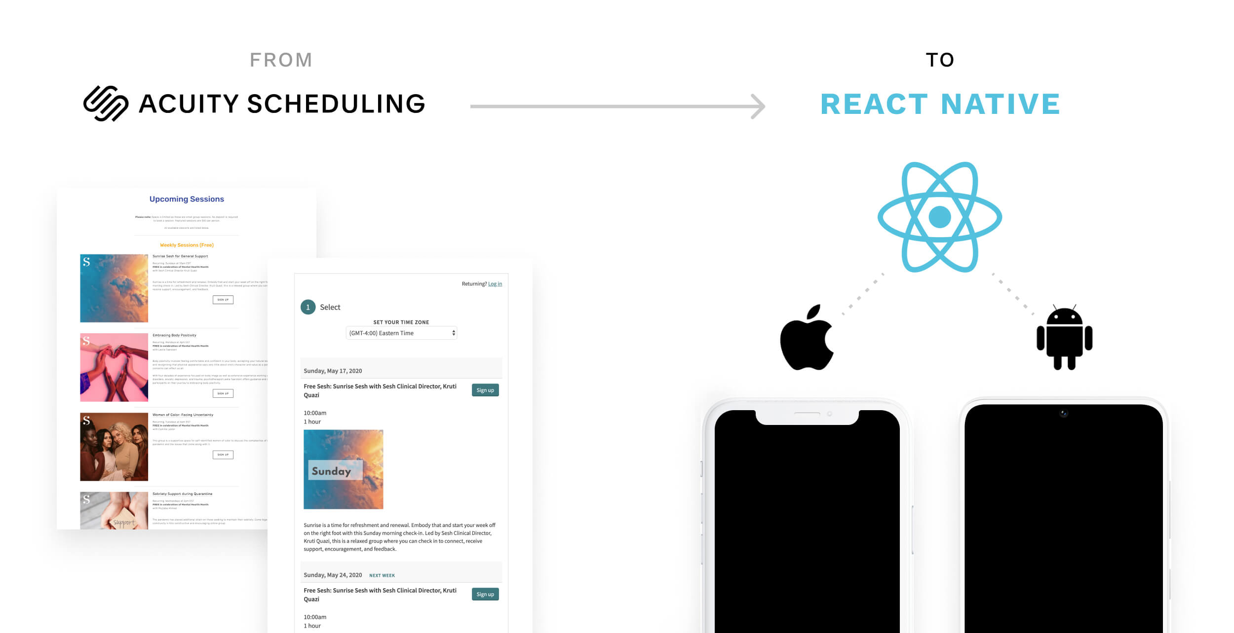
Sesh had previously found product/market fit while functioning on a SquareSpace site that connected to Acuity scheduling where members could book group support sessions. To move forward, Sesh needed a mobile platform solution where they could update the app and access user information while being HIPPA compliant with a secure backend architecture.
Unique Problems to Solve
01
Build towards a turn-key backend and CMS solution to get Sesh to next round of funding without a dedicated engineering team.
02
Ruthlessly prioritize the feature set to make the ~10wk timeline to submit the app and have it accepted in the App Store.
03
Elevate Sesh's existing brand for a digital product that can compete in the market.
Prioritizing "Critical Path"
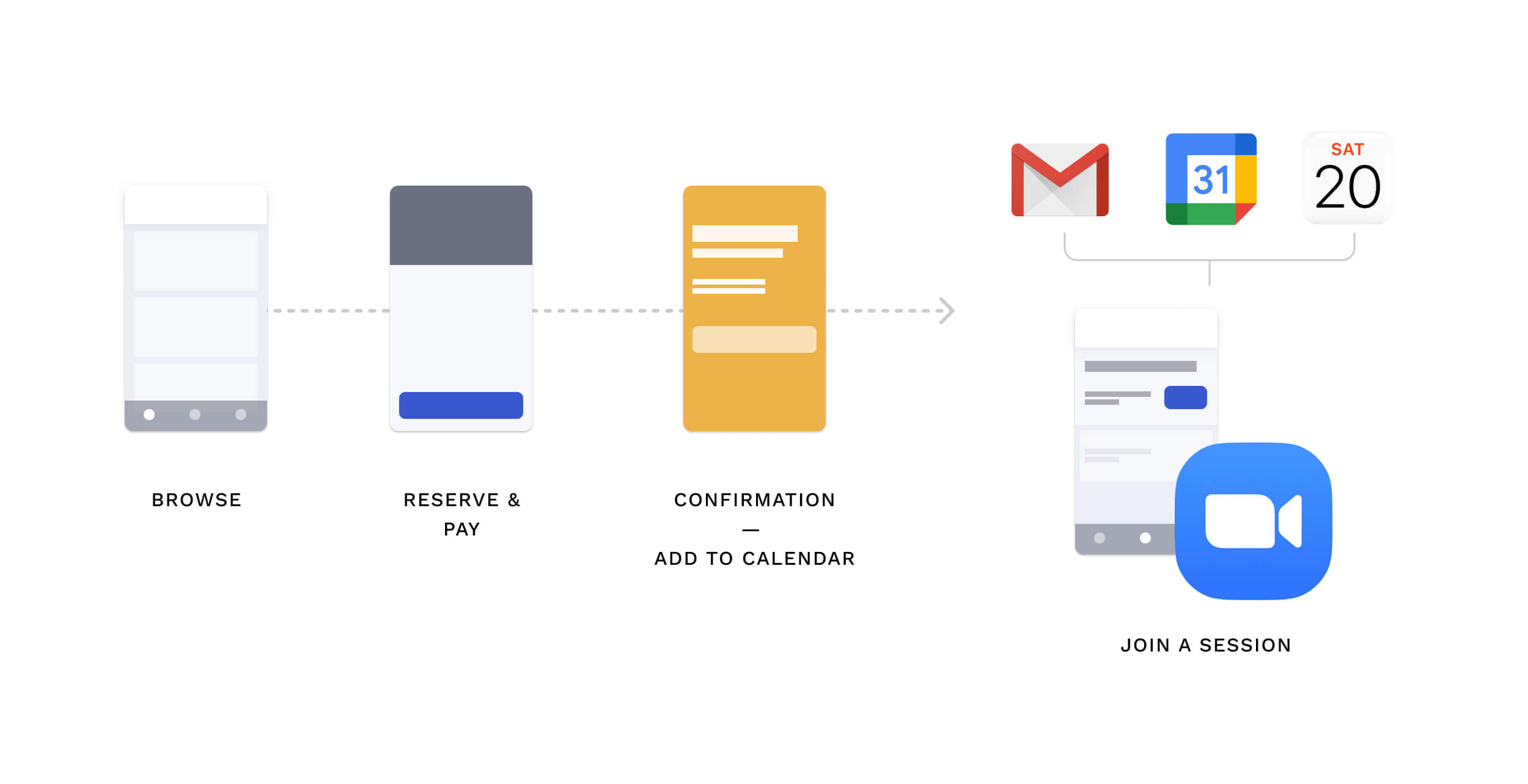
We facilitated an Experience Mapping session to understand what the desired end-to-end experience would be, and which steps were absolutely critical to define the smallest shippable product that was valuable to users.
Elevating the Look & Feel
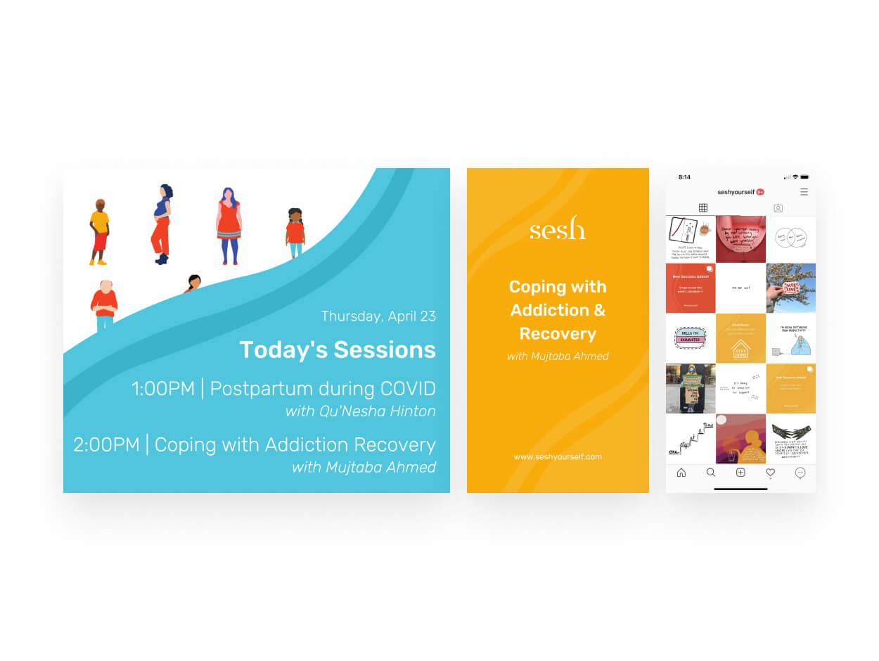
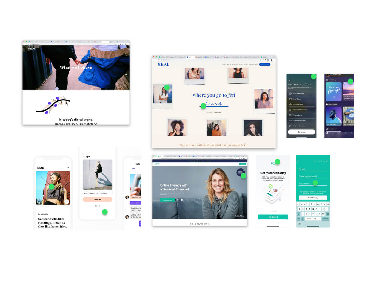
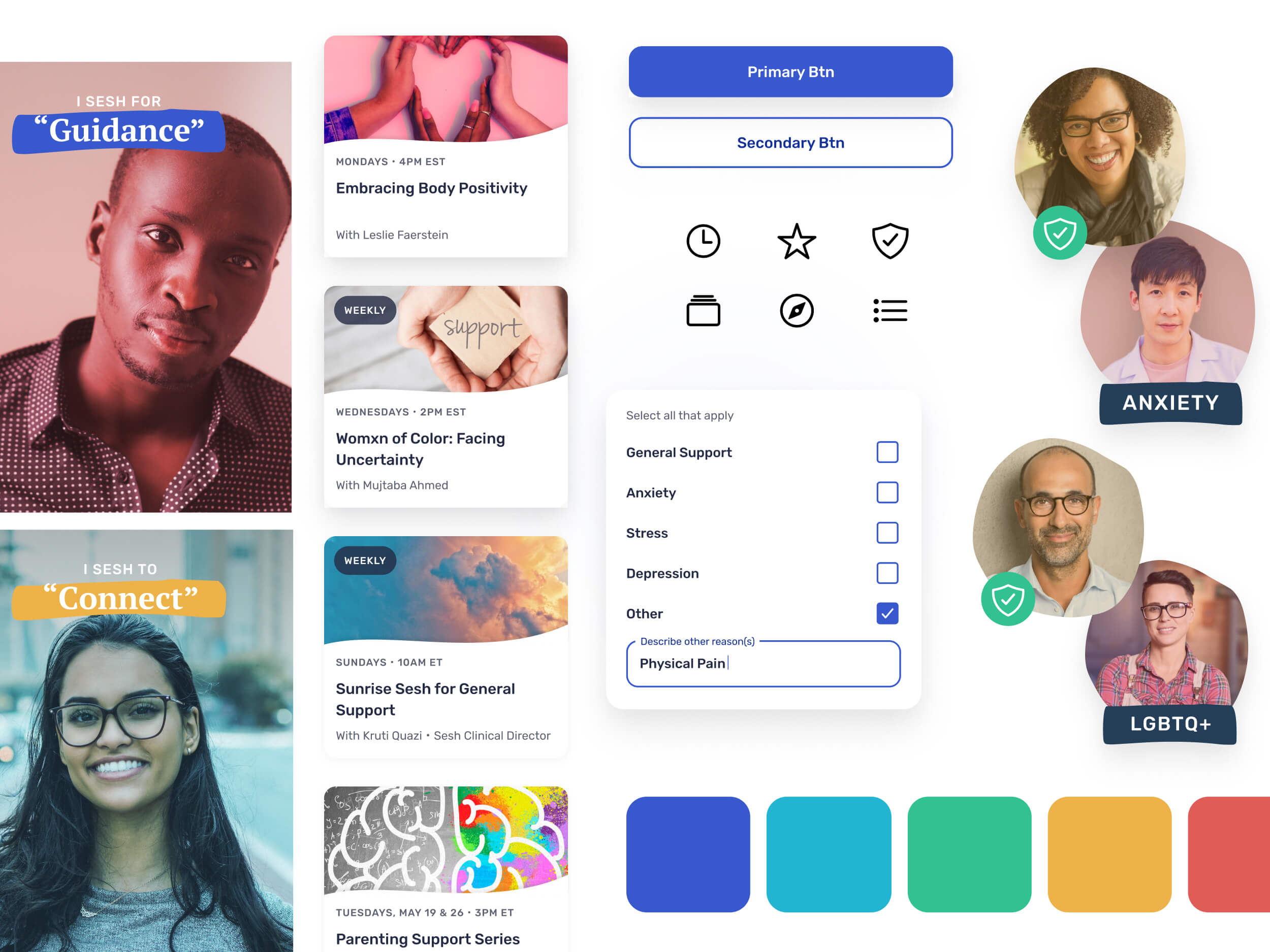
One of the design challenges was taking the existing visual brand they had at the time & extending an elevated version to be applied to a digital mobile app. A small design system was crucial to ensure the engineers could move quickly within the tight timeframe we had.
Showing investors value through efficacy
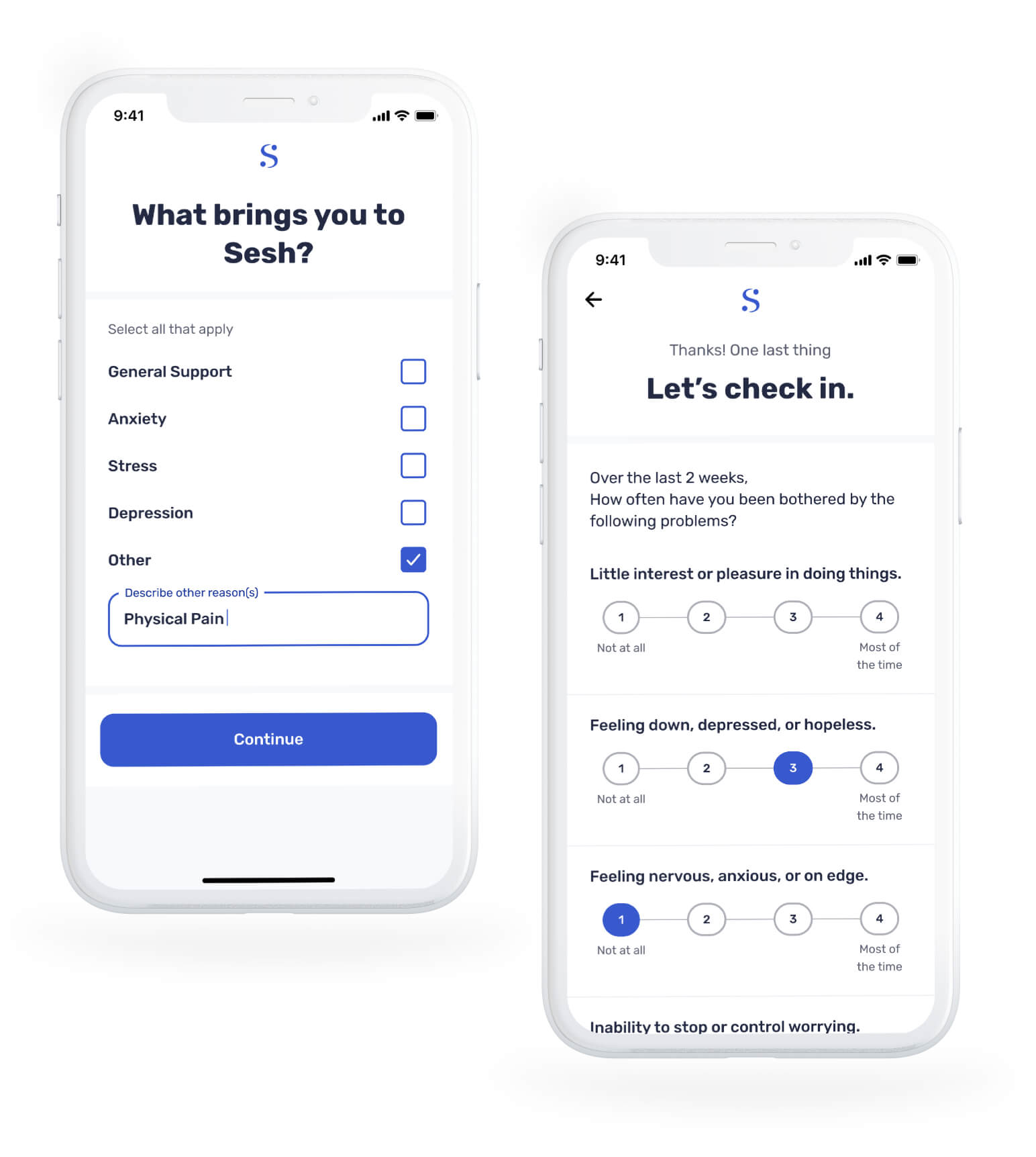
To show efficacy of the product, we needed to gather participants mental health symptoms and gauge the improvement of those symptoms over time. I took the generic form therapists use for patients to fill out, and improved the experience by incorporating a light, conversational tone with quick and easy interactions.
The Result

